

Because Healthcare Deserves a Better First Impression
At Xceptive Solutions LLP, we specialize in healthcare landing pages that put the ‘care’ back into clicks. Let’s explore what makes a healthcare landing page effective, empathetic—and yes, ready to convert like a pro.
The Human Touch: Crafting Trust with Design
In healthcare, your audience isn’t just buying a product. They’re seeking relief, answers, or even life-saving support. That’s why your landing page must do more than sell—it must reassure.
- Clarity over Cleverness: Ditch the jargon. “Get same-day appointments” beats “instantaneous access to integrative primary care facilitation.” Always.
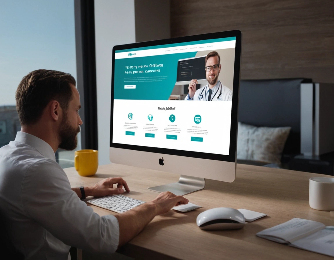
- Real Images: Use photos of your team, your clinic, or happy real patients (with consent!). Stock photos? We see you, Chad the fake radiologist.
- Accessible Forms: Keep it simple. Name, number, message. That’s it. If someone’s bleeding (metaphorically or not), they don’t want to fill out a novel.
- Speed is Life: 53% of mobile users leave if a page takes more than 3 seconds to load. Optimize like lives depend on it—because sometimes, they do. Source
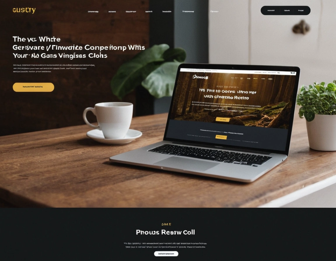
Key Sections Every Healthcare Landing Page Must Include
- Headline and Subheadline – Immediate clarity. Think: “24/7 Virtual Care for You & Your Family.”
- Intro Paragraph – A short welcome that makes the visitor feel seen. Mention how your service helps real people.
- Services Overview – Whether you’re a dermatology clinic or dental group, list key offerings.
- Meet the Team – Friendly bios build trust. Bonus: include credentials!
- Social Proof – Real patient testimonials. Star ratings. Press mentions.
- Visual CTA – A clean, clickable “Book an Appointment” or “Speak with a Specialist.”
Need a Website Checkup?
Your healthcare website could be costing you patients. Let our team run a full UX and SEO diagnostic.
The Emotional Layer: What You Say (and How You Say It)
Let’s talk tone. Are you calm? Reassuring? Friendly? People come to your site with questions—and maybe fears. Your job is to answer both.
Avoid this: “We are a vertically integrated provider of telemedical diagnostics.”
Say this instead: “We connect you with trusted doctors, anytime, from anywhere.”
Always think: “Would this sentence make someone feel safe, seen, and in control?” If not, rewrite it.
Internal Interlinking: Keep Visitors Exploring
Guide users to other helpful resources on your site. This improves user experience and boosts SEO.
Case Study: HealthyPage – From 1% to 8% Conversion Rate
One of our clients, a telehealth startup, came to us with a sluggish landing page that barely converted. After redesigning it with clean CTAs, patient testimonials, and emotional copy, we helped them grow from a 1% to an 8% conversion rate—without increasing their ad spend.
Examples of Great Healthcare Landing Pages
- CVS MinuteClinic – Fast, clear, and built for mobile.
- CareDash – Patient-focused design with deep trust signals.
- Oscar Health – Beautiful UX, punchy headlines, and intuitive navigation.
Ready to Upgrade Your Patient Experience?
Don’t wait until your bounce rate is higher than your patients’ blood pressure.